Versal Finance
Making Finance Accessible for Everyone
Project Goals
Versal Finance aims to revolutionize personal banking by creating an accessible, intuitive platform that caters to users with diverse needs, particularly those with disabilities that affect their interaction with traditional banking interfaces.
The Challenge
Traditional banking apps often present barriers for users with conditions like dyscalculia or visual impairments. Our challenge was to create an interface that's both functional and accessible to all users.
My Role
As lead designer, I focused on creating an accessible design system and conducting extensive user research with individuals who have various disabilities affecting their banking experience.
User Research
Our research focused on understanding the unique challenges faced by users with various disabilities when managing their finances. We conducted in-depth interviews and usability tests with a diverse group of participants.
Accessibility First
Designing with accessibility as a core principle, not an afterthought.
User Interviews
Conducted in-depth interviews with users having various disabilities.
Usability Testing
Rigorous testing with diverse user groups to ensure universal usability.
Research Findings
Interview Methodology
Conducting Interviews
Scheduled and personally conducted one-on-one virtual interviews with participants. Used interpersonal skills to encourage detailed and honest feedback, offering a $50 Amazon voucher as appreciation for their time.
Observations and Probing
Carefully observed body language and facial expressions during interviews, noting subtle reactions. Used targeted probing techniques to explore specific topics and gain deeper insights into participants' perspectives.
User Interview Feedback

Queen Haul

Kingsley Orji

Amanda Sandwell
User Personas
The insight I got from the user interviews we conducted led to this user personas

Margret Tamford
Gender: Female
Age: 54
Disability: Dyscalculia
Background
• Margaret prefers traditional banking methods and is resistant to integrating technology with her financial activities.
• As she ages, Margaret finds the physical demands of these bank visits increasingly challenging and stressful, impacting her ability to manage her finances comfortably.
Needs
- Margaret needs a quick way to check her bank account.
- She requires an app with easy navigation to understand her financial inflows.
- She wants to manage her account remotely to avoid visiting the bank.
Pain Point
- Apps confuse Margaret with complex numbers due to her dyscalculia.
- She struggles to track her balance and transactions.
- Visiting the bank to understand her account tires her out.

John Smith
Gender: Male
Age: 45
Job: Civil engineer
Background
• Johnson maintains an optimistic outlook despite being aware of life's impermanence, and diligently manages his household finances.
• He values organization, believing it is crucial for securing his family's financial future.
Needs
- Johnson needs to be able to manage his bills and remember to pay the bills before the bills are due.
- He needs an interface that's user friendly, good visuals and well arranged informations.
Pain Point
- Johnson invests considerable time managing financial apps, yet sometimes struggles with confusion.
- He experiences frustration when his wife inadvertently exceeds their set budget.
User Scenarios
Based on our research and personas, we developed detailed scenarios to understand how our users would interact with the application in real-world situations.

Margret's Journey
Maggie, 75, struggles with dyscalculia, which complicates understanding numbers. As she adapts to changes in banking, she seeks an app that simplifies her financial overview. She found an app that displays her account balance clearly, using charts to visualize inflows and outflows. This app automatically categorizes transactions, making it easier for her to manage her finances without the physical strain of visiting the bank.

John's Journey
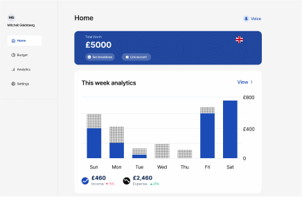
Johnson, a father of three, is committed to supporting his family and is skilled in budgeting. He uses a computer application that allows him to easily set up budgets, interact with well-placed elements, and customize settings for a clear view of his finances through analytics.
Competitive Analysis
We conducted a thorough analysis of leading fintech solutions to understand the current market landscape and identify opportunities for innovation in accessibility.
| Aspect | Revolut | Monzo | Sterling | Tide |
|---|---|---|---|---|
| UI Design | Modern, vibrant design with a sleek interface | Clean, minimalist UI with a coral color scheme | Professional, neutral UI with intuitive layout | Simple, blue-themed interface for business use |
| UX Design | Multi-currency support for diverse user needs | Strong focus on budgeting and real-time updates | Full-service banking with emphasis on transparency | Business-focused features for small enterprises |
| Dashboard | Categorized sections for easy navigation | Tab-based layout for quick access to features | Detailed dashboard with categorized transactions | Business-centric dashboard for easy navigation |
| Color Scheme | Vibrant colors for a visually appealing brand | Consistent use of coral color for brand identity | Neutral colors for a clean professional look | Blue color scheme for a professional touch |
| Multi-Currency | Supports multiple currencies for international use | Supports international transactions and travel | Multi-currency accounts for global accessibility | Focus on GBP for UK businesses |
| Budgeting | Basic budgeting tools available | Robust budgeting features and analytics | Budgeting tools with insights and categorization | Business expense tracking and budgeting features |
Accessibility Considerations
Accessibility is a cornerstone of the design process for Versal Finance, with a strong focus on understanding user needs to enhance app usability. A critical aspect of this is adhering to WCAG guidelines, which are crucial for ensuring the app is inclusively designed for all users.
Visual Impairment
- Technology Accessibility: In developed societies, technology such as screen readers (Voice Over for iOS, Talkback for Android) and larger fonts enhance independence for the visually impaired.
- Adherence to WCAG Guidelines: Followed WCAG guideline 1.4.3 to select color combinations with high contrast, improving readability for users with visual impairments.
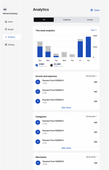
- Enhanced Visual Design: Ensured accessibility by redesigning graphical information to be visually distinct not just by color but also texture, following WCAG guidelines 1.3.1 and 1.4.11.
Auditory Impairment
- Integrated visual aids such as charts and tables, aligned with WCAG guideline 1.3.3 (Sensory Characteristics), offering multiple ways to process financial information without relying on sound.
- Text throughout the app's interface is carefully arranged to ensure clarity and brevity, enhancing readability and comprehension.
- A holistic approach to design ensures that reliance on auditory cues is minimized, supporting full app accessibility and independence for users with hearing challenges, in line with WCAG 2.1.1 (Keyboard).
Physical Impairment
- Physical impairments like arthritis and Parkinsonism can hinder the ability to use computers and the internet, requiring advanced accessibility features to support basic online functions.
- The application supports keyboard navigation and has simplified navigation options, complying with multiple WCAG guidelines such as 2.5.6 for concurrent input mechanisms and 3.2.3 for consistent navigation.
- Versal incorporates voice input and a large touch target size (44px) to facilitate easier interaction with the app, making it accessible for users with limited mobility and reducing the risk of errors.
Cognitive Impairment
- The app is tailored for users like Margaret, an older woman with dyscalculia, focusing on simple and intuitive interfaces that enhance her ability to manage financial activities with visual aids like well-defined images, icons, and color-coded graphs.
- Visual Data Representation: Complies with WCAG guideline 1.3.1 by using visual representations for data, such as graphs and charts, to make financial information more understandable.
- Navigational Clarity: Each app page has a clearly titled header (WCAG 2.4.2) and a highlighted icon indicating the current page (WCAG 2.4.3), simplifying navigation and enhancing user orientation.
Key Features & Insights
The research process provided several insights into possible features for Versal Finance. Our findings led to the development of key features that address both accessibility challenges and user needs.
Key Features
- Expense Tracking
It enables users to easily track and monitor their spending in order to learn more about their spending patterns
- Budget Monitoring
Users can build and manage budgets with Versal Finance to ensure they remain within their tight budgets
- Inflow and Outflow Analytics
Users can track spending trends with real-time daily, weekly, monthly, and quarterly money inflows and outflows to help them make better financial decisions
- Multi-Account Sync
They can sync with several bank accounts, collecting financial records in one platform
- Personalized Spending Tracking
Users may setup custom expense categories and monitor spending trends for each one
Accessibility Challenges
- These challenges included difficulties in navigation complex interfaces
- Lack of alternative text for images
- Proper representation of graphs
Ideation and Prototyping

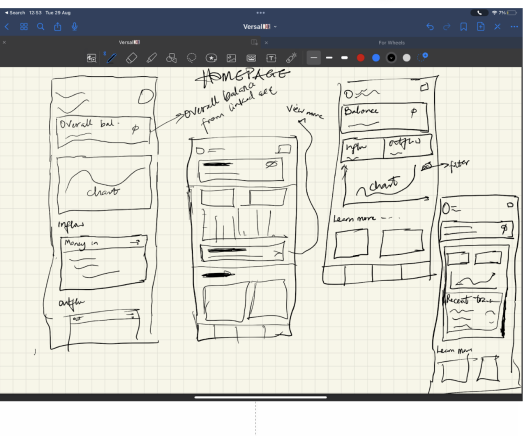
After defining the Versal finance structure, I started by outlining the key features and functionalities I envision for Versal, considering user needs and pain points I identified during the research process. I also sketched a basic layout structure, to determining the placement of essential elements like navigation bars, transaction history and account details.I also created a simplified wireframe, outlining the main screens of the app. This included the home screen, transaction history, budget etc.
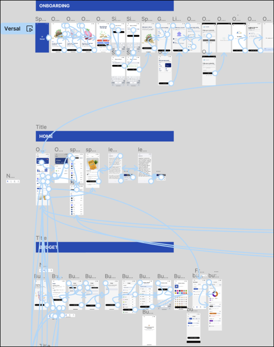
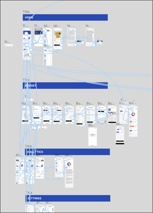
Drew arrows to indicate the flow of the app navigation between different screens. I ensured a logical and user friendly progression through the app.Positioned key elements such as buttons,icons, and information fields within each screen.I considered the hierarchy of information and the visual balance of the interface.
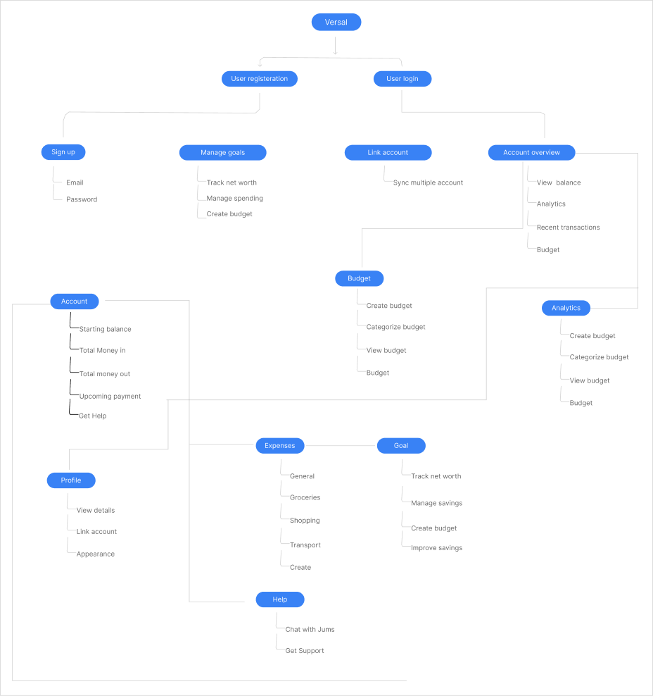
User Flow
The insight I got from the user interviews we conducted led to this user personas
User Journey Map
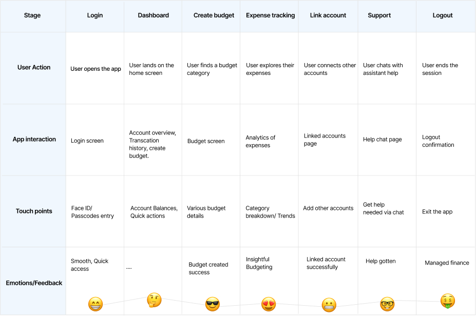
User journey map was created to highlight several key touchpoints and experiences
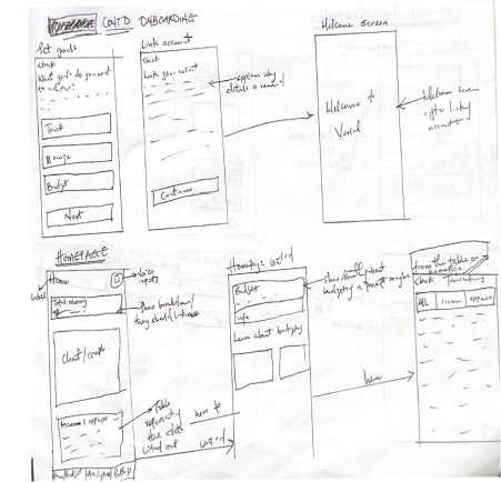
Sketches
Initial sketches helped visualize the interface and user interactions
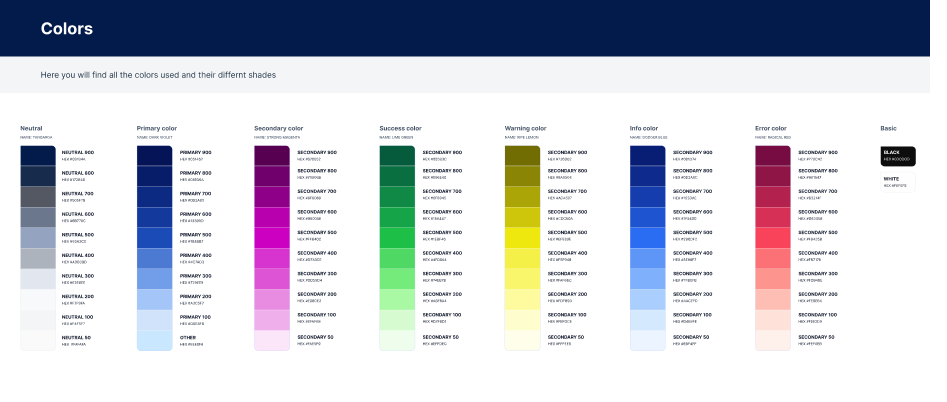
Colour Palettes
The colour palettes were carefully selected using a combination of colors throughout the app. These palettes are carefully curated to create a visually pleasing and harmonious design that also aligns with the brand identity.
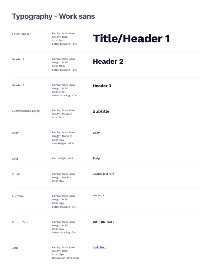
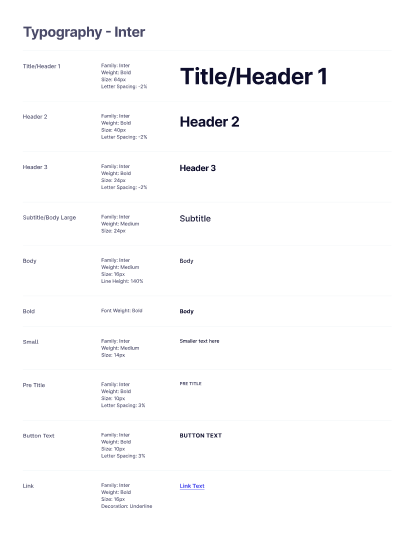
Typography
The typography was carefully selected to ensure readability and visual hierarchy throughout the app, creating a consistent and professional appearance that enhances the user experience.
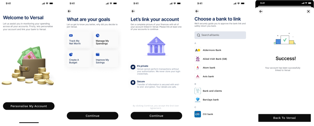
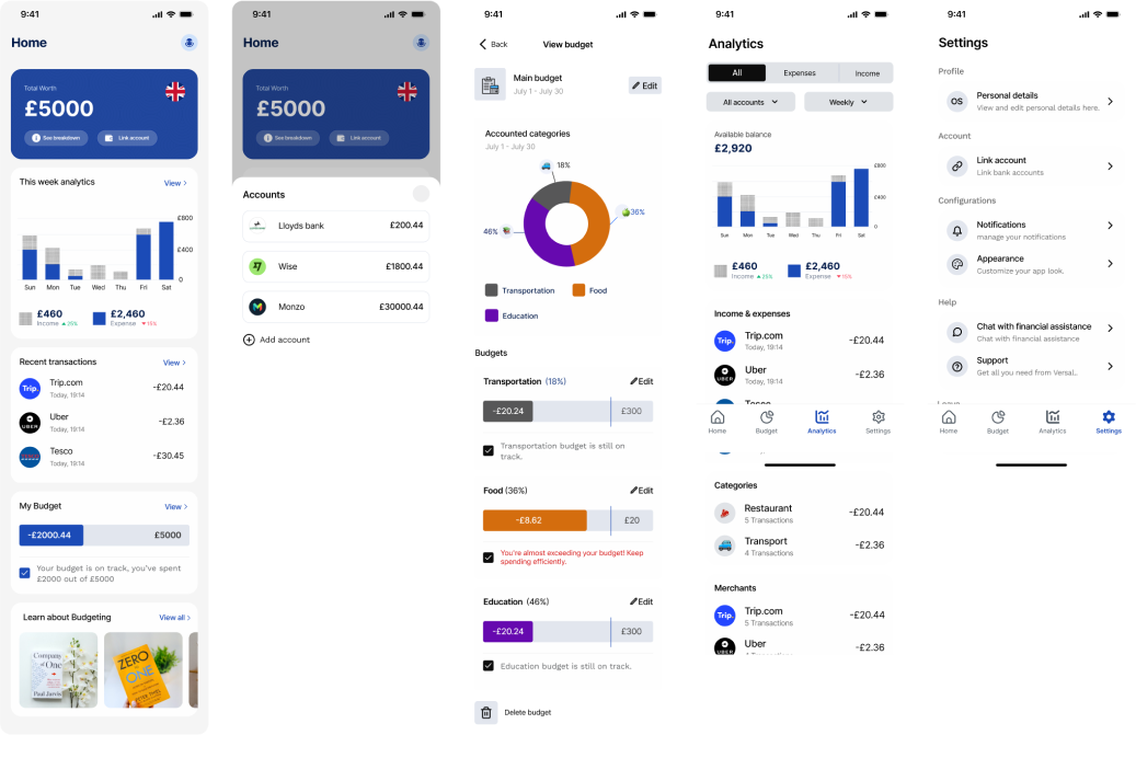
High Fidelity Screens

Prototyping
Usability Testing
Study Overview:
Objective: The main purpose of the usability test was to evaluate the functionality of the Versal app, confirm design decisions, and understand how users interact with the application.
Participants: The test involved 10 participants aged 25-35, with a gender distribution of 6 males and 4 females. None of the participants had disabilities.
Methodology: Using mobile phones, participants were briefed on user personas and asked to perform specific tasks within a 10-minute timeframe. Tools used included the System Usability Scale (SUS) for quantitative feedback and the think-aloud protocol for qualitative insights.
Key Performance Indicators:
Task Success Rate: Task success rate was measured for various user tasks. The KPI for this metric was set at a minimum of 65%, and the actual success rate averaged 87%.
Time on Task: The KPI for time on task was set to ensure that tasks were completed within a reasonable time frame. Tasks were considered efficient if completed within a set time limit (e.g., under 10 minutes), and the actual completion times met these criteria.
User Satisfaction: User satisfaction was measured using a 5-point Likert scale (1-Very dissatisfied to 5-Very Satisfied). The KPI was set at an average satisfaction rating of 4.5, and the actual average rating was 4.8.
Results and Analysis
Quantitative Outcomes: The Versal app achieved a SUS score of 80.75, indicating good usability with potential areas for improvement.
Qualitative Feedback: Participants generally found the app easy to use, with intuitive navigation and a straightforward layout that facilitated tasks like creating budgets and accessing financial summaries.
Insights: The think-aloud protocol provided valuable data on user cognitive processes and interaction experiences, highlighting the app's effectiveness and accessibility.
Updates after Testing
1/6
Reduction of the onboarding process: The onboarding process was streamlined by eliminating several steps and adopting a familiar method, allowing users to create an account upfront by merging the sign-up process, including email and password requirements.
2/6
Improve Navigation: During the testing phase, few of the participants suggested The navigation was improved by allowing users to create a budget right from the homepage.
3/6
Breakdown clarification: The "see breakdown" text" was modified to see accounts with a clear label, as well as increasing the text size and expanding the clickable area.
4/6
Enhance feature integration: A book recommendation is supplied as an extra bonus if the user's budget hits 80%.
5/6
Color code destructive action: Color coding was used to emphasize destructive operations such as budget deletion.
6/6
Maintain Consistency in Design: Consistent color coding was used to reduce confusion for different states in the budgeting section.
Dark Mode
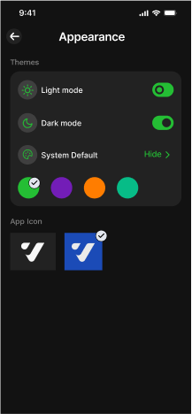
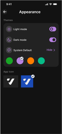
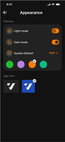
Upon learning that 80% of iPhone users prefer Dark mode over Light mode, I implemented the use of Figma color variables and also from the settings page where they can customize font colors. The dark mode feature in Versal is crafted to offer users a distinct visual experience that is gentle on the eyes, particularly in low-light conditions.

Multi-platform Accessibility
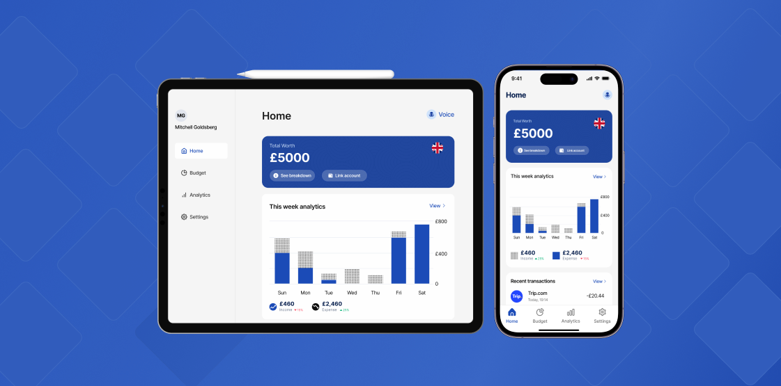
According to WCAG guideline 1.4.10 (Reflow), an inclusive approach was used beyond the mobile application, taking into account additional displays such as iPads and computers. This consideration arises from studies that show that bigger displays might assist a variety of user groups, including individuals with physical, cognitive, visual, and auditory/mild hearing difficulties). In accordance with WCAG guideline 1.4.4, such displays give adequate room for content presentation, contributing to improved readability and user interaction (Resize Text).
Particularly, users with low vision, notably those with diabetic retinopathy, benefit from the magnified display available on bigger displays, which improves accessibility in accordance with WCAG guideline 1.4.5. (Images of Text). Furthermore, those with physical disabilities who may struggle with small touch targets benefit greatly from the iPad's bigger screen, which fits with WCAG guideline 2.5.5. (Target Size).
Furthermore, the design implemented several spaces between interface elements, adhering to WCAG guideline 2.5.6 (Concurrent Input Mechanisms), effectively addressing the concern of inadvertent taps on incorrect elements. This design choice enhances user experience by providing ample room for interaction while preventing potential input errors.
Desktop View
Tab View

ONBOARDING VERSAL
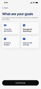
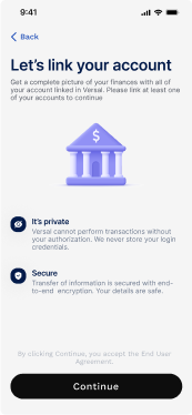
Creating an account
Versal was created with top-notch security features when you sign up. It offers a straightforward onboarding process, guiding users through several verifications to ensure their money is safe during registration.
Accessibility consideration (WCAG)
- Descriptive text identification (3.2.4 AA)
- Label (2.4.6 AA)
- Input field (1.3.5 Identity purpose)
- Use color and text (3.3.3 A)


HOME

The main screen of the app is made in a way users can easily see breakdowns from different accounts and link their other bank accounts directly. They can also view their total balance. The home page is labeled for accessible page labeling and the use of voice command is also available in Versal.
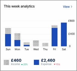
Another exciting thing is the use of charts for analytics which shows the inflow and outflow (spending) at every point. The recent transactions show all the transactions from various linked accounts, it’s like seeing all expenses at a go!

Budgeting is the main aspect of the application and users can easily view directly from the homepage how much they’ve budgeted and how much they’ve spent out of it.
Learning is always an interesting way to understand things better, Versal offers several learning materials to best understand how to go about budgeting or how to make life in budgeting easier for people.
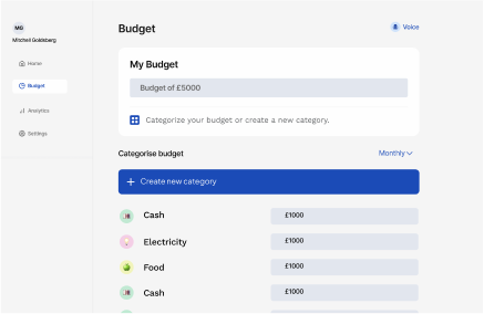
BUDGET
The budgeting feature allows users to:
- Set financial goals and targets - Create and manage categories (e.g. housing, transportation, food) - Track income and expenses - Assign transactions to categories - View detailed budget breakdowns and progress - Receive alerts and notifications for overspending or unusual activity - Adjust budget allocations and make adjustments as needed. This budgeting tool empowers users to take control of their finances, make informed decisions, and achieve financial stability.
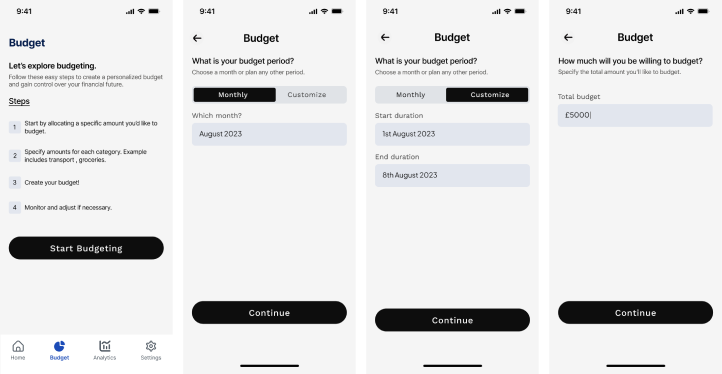
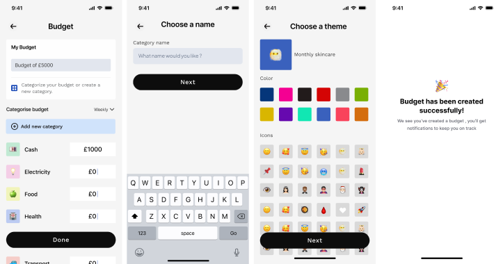
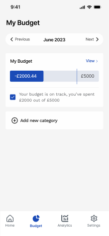
The budget home page offers a comprehensive overview of your financial progress, providing a clear indication of whether you're on track to meet your goals.
From this central hub, you can monitor monthly budget trends, add new categories, and make informed decisions to stay financially on track, ensuring you're always in control of your financial well-being.